Spotlight on!
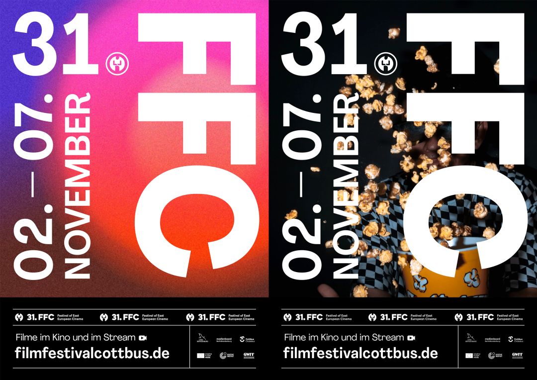
After a colourful and lavish 30th anniversary, the FFC is reflecting on its roots. A preview of the festival's content has been deliberately dispensed with and instead the heart of the festival, the medium of film itself, has been brought to the fore. The interpretative scope offered by the graphic is intended to arouse anticipation and curiosity about the upcoming FFC. Take a close look at the graphic. What do you see and feel? Surprise, confusion, liveliness, diversity? Our graphic represents the character of the FFC and is as diverse as our films.
The Transformation
The new design focusses and reduces. It is composed of 3 elements: Spotlight in the background, present typography in the foreground and the black slate at the bottom of the image.
The bright spotlight in the background sets the accent and leaves room for what may come and what will be seen. The variety of films and genres ("diversity") is represented (instead of individual elements) with the help of a spot consisting of a wide spectrum of colour shades. In addition, other motives will be used during the festival to make the film and cinema experience tangible. Let them transport you to the FFC venues, smell the fresh popcorn, feel the soft armchairs, be excited about the festival programme.